drag me

drag me
THE CHALLENGE
Packed with artificial claims and copycat design, healthy snacking has quickly become something people endure and avoid, not enjoy. The demands of modern life make it difficult enough to get fruit, veg and healthy ingredients in our diets as it is... Pukpip wanted to bring the joy back to healthy snacking. But as a completely new brand entering the market, they needed to stand apart from the worthy wellness crowd while making it clear they weren't a sugar-loaded indulgence.
THE INSIGHT
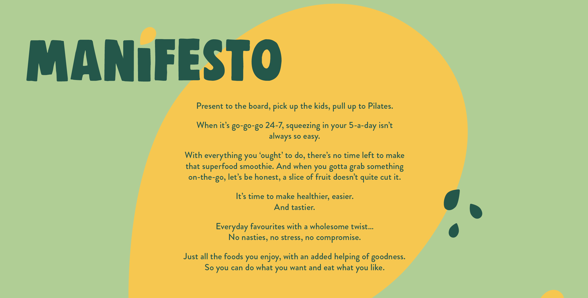
For so many people, health has started to feel like hard work. Between busy lives and OTT wellness culture, the act of eating well is losing its spark. It's too much effort, too complex. The list literally changes every day. Healthy snackers want something that makes feeling good feel easy.

THE EXECUTION
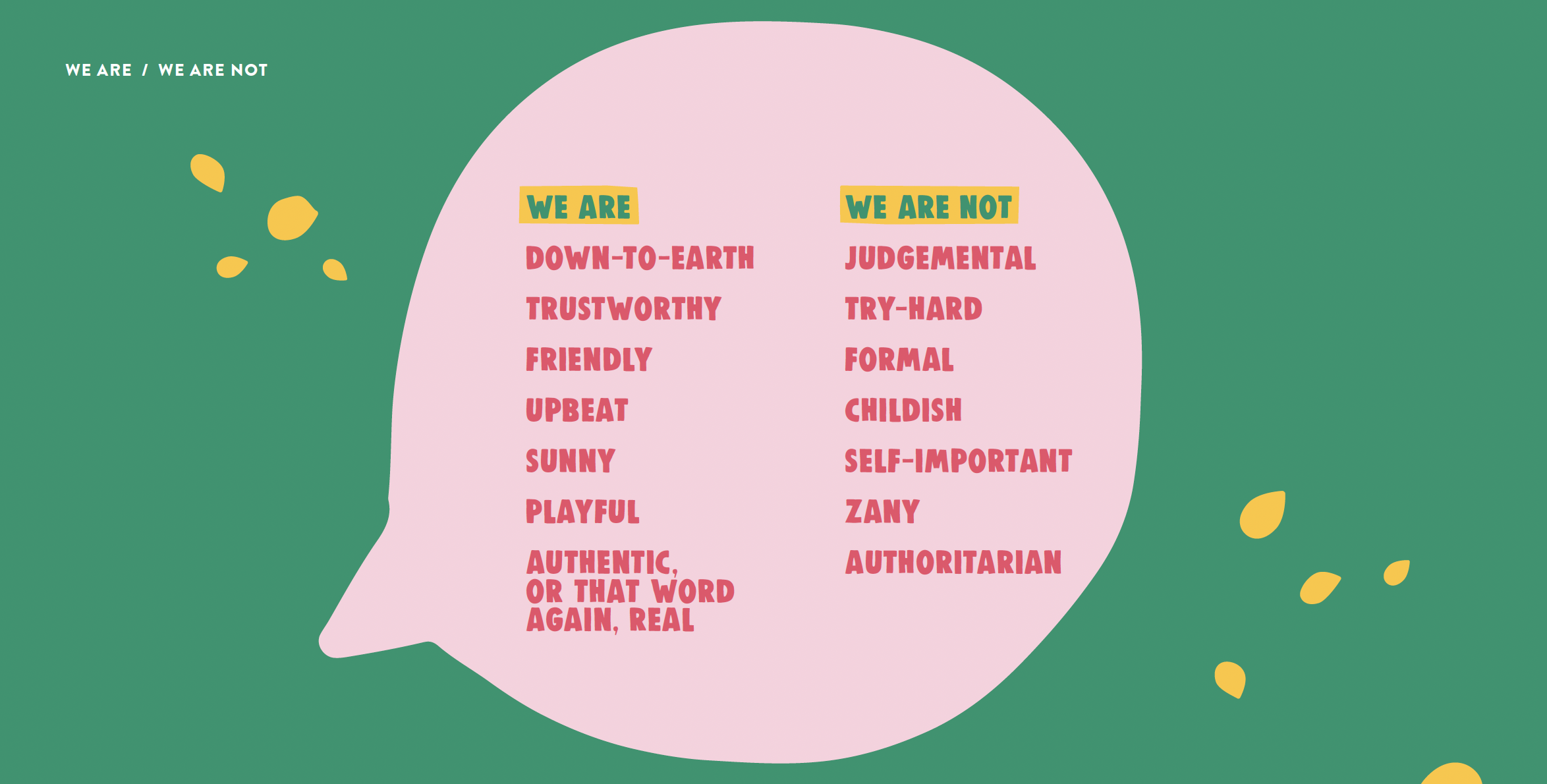
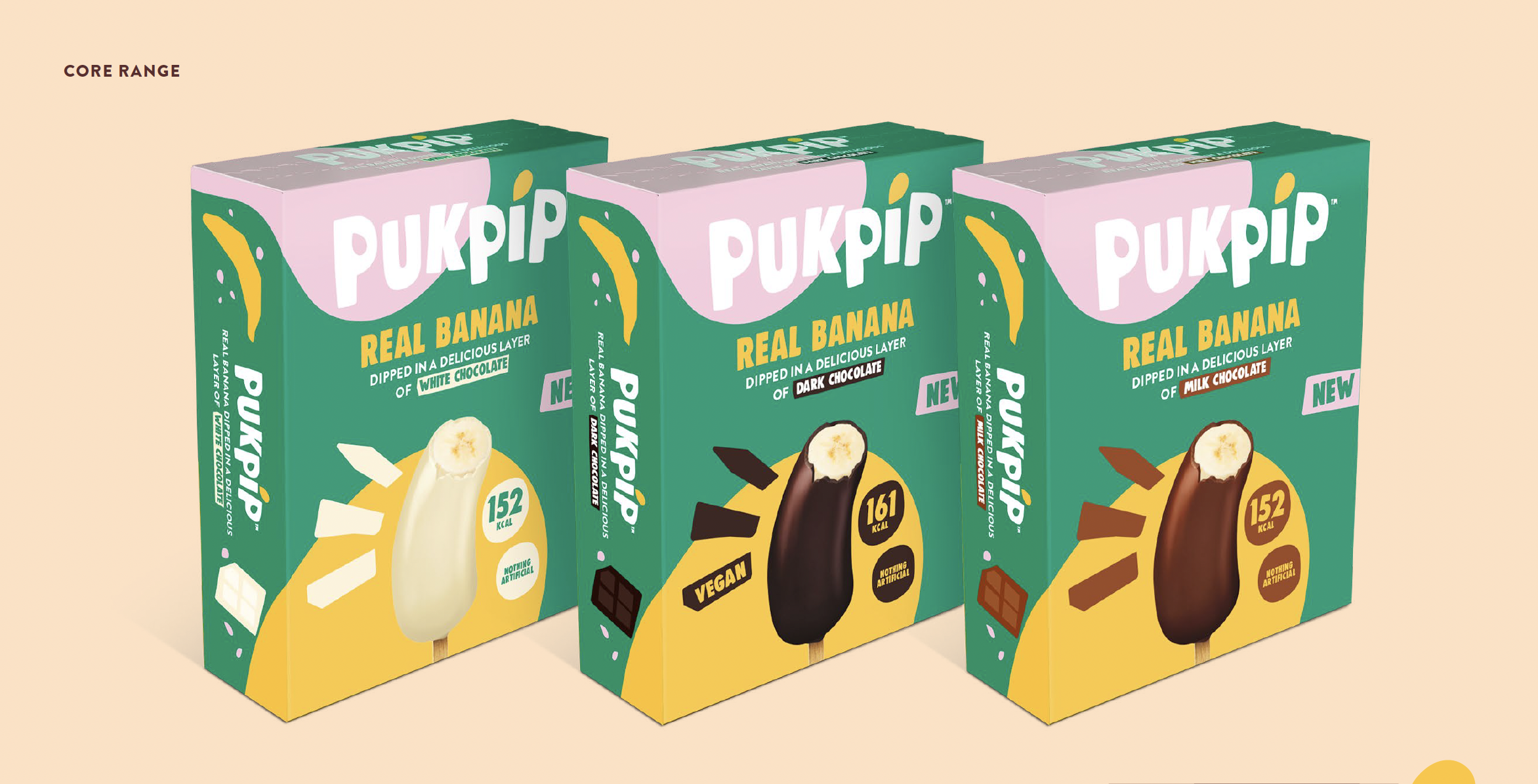
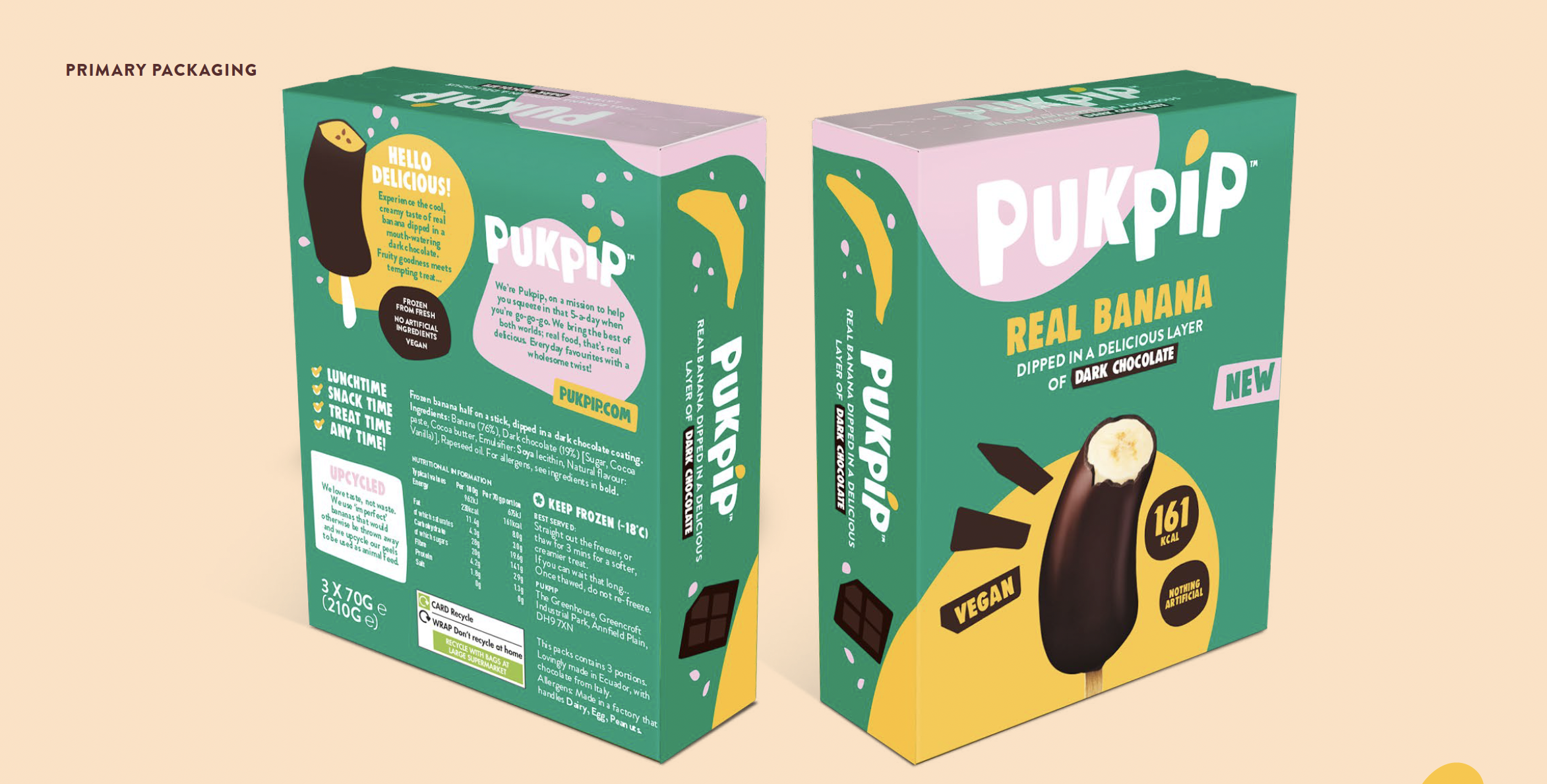
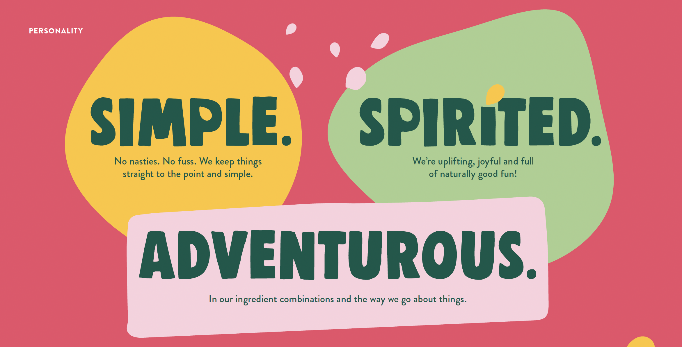
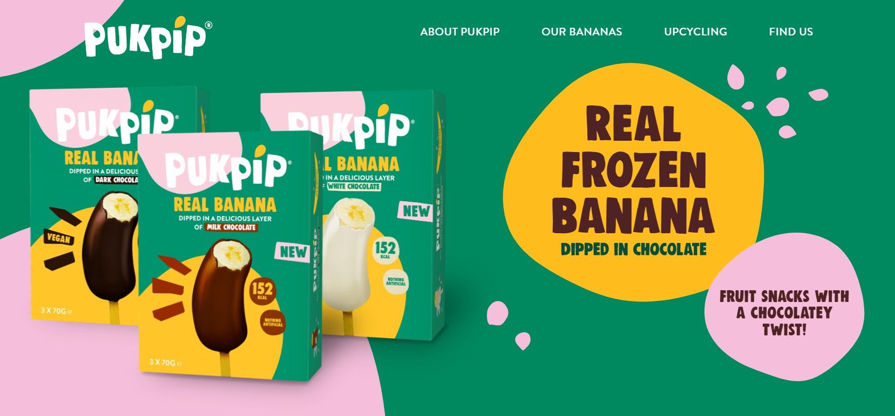
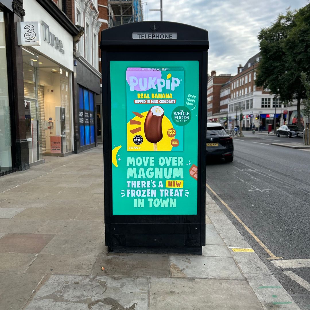
A naturally simple brand that celebrates the beauty of real people, real ingredients, and not taking life too seriously. No fakery. No fuss. Everything about Pukpip feels honest, vibrant and joyfully unpolished. Organic shapes and imperfect edges capture the spontaneous energy of nature, and a bright, sun-soaked colour palette mirrors the positivity of the brand. The Pip – Pukpip’s signature symbol – brings everything together.
THE CRAFT
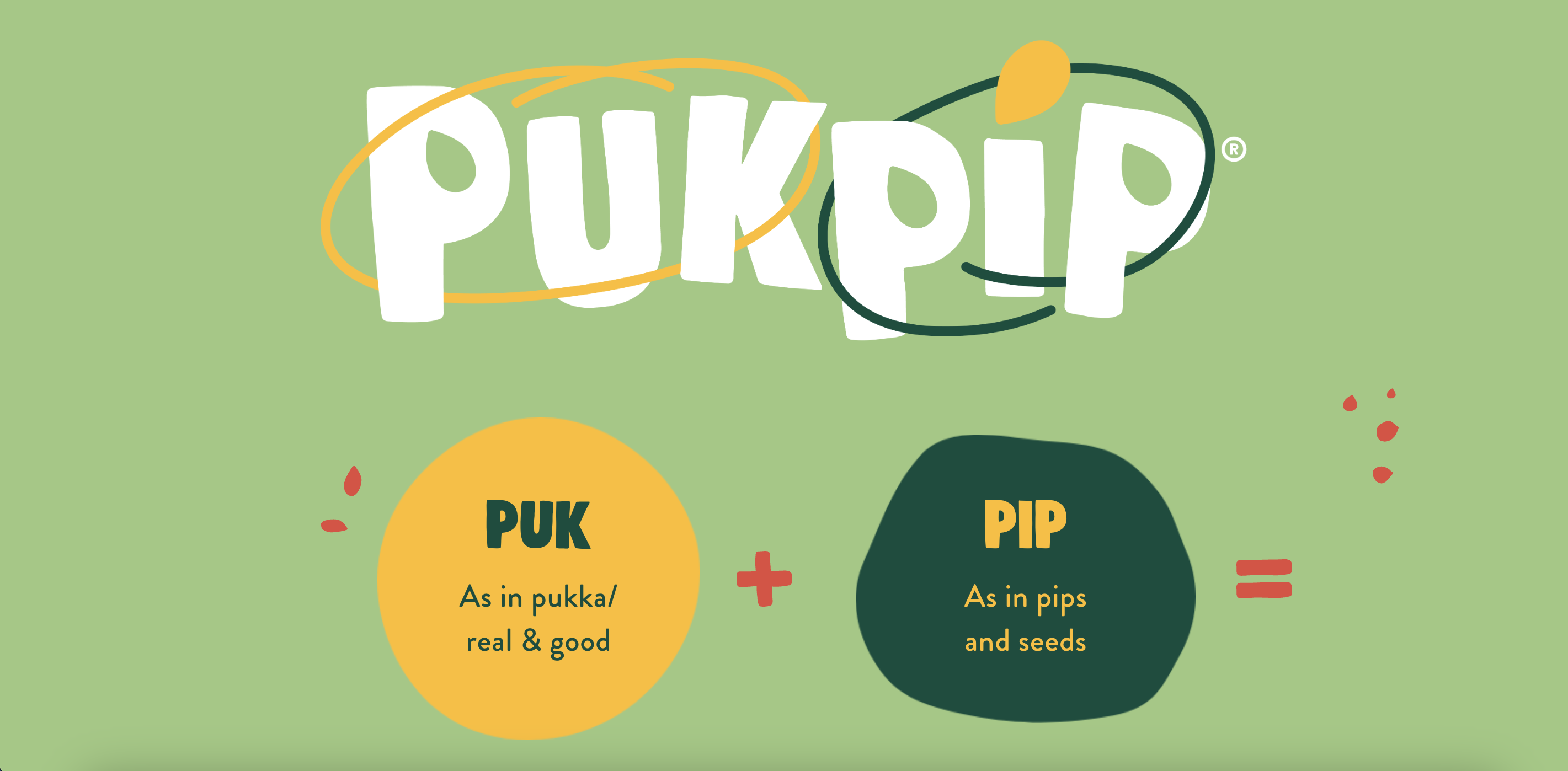
Pukpip: an invented, compound name created to sound as real and joyful as the fruit it comes from. How did I get there? ‘Puk’, from pukka, meaning genuine, good, the real deal. ‘Pip’, from the seed – the small start of something full of life. Together they form a name that’s simple and sunny.
And that same spirit carries through every line of copy. The Pukpip voice is real, friendly and upbeat. It’s conversational, not corporate; natural, not polished. A verbal identity that believes being good shouldn’t mean being boring. And that simplicity can be seriously good fun.